
Rubby 千層蛋糕專賣 / 品牌形象
-
我們的目標是創造一個簡潔、現代且優雅的品牌。
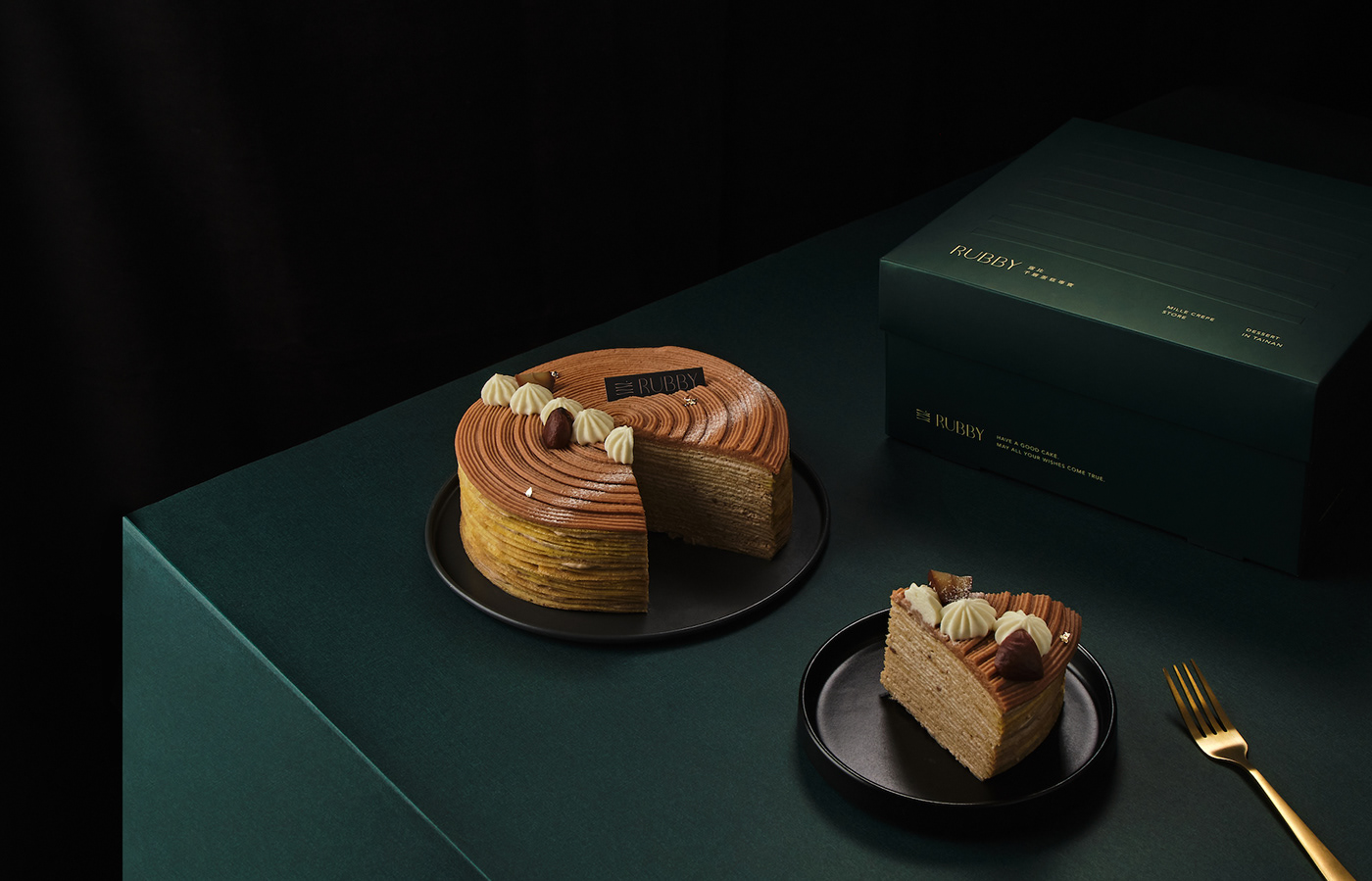
設計手法上是以千層蛋糕片的層層堆疊為形象,來展現Rubby專業千層手作的獨特之處。
這個概念象徵著Rubby的精湛技藝和對細節的追求,同時展示出千層蛋糕層層疊疊的豐富口感。
並使用深藍和淺米色的顏色搭配。深藍代表著專業、高品質,彰顯Rubby的專業形象。而淺米色則象徵著細膩、溫暖和自然,呈現Rubby手工製作的甜點所散發的溫馨感。同時,我們使用優雅的字體來呈現Rubby的品牌名稱,以突顯其優雅氣質。
Our goal is to create a concise, modern, and elegant brand. The design approach is based on the layered stacking of cake slices, representing the unique craftsmanship of Rubby's handmade layered cakes. This concept symbolizes Rubby's exquisite skills and attention to detail while showcasing the rich texture of layered cakes. We use a combination of deep blue and light beige colors. Deep blue represents professionalism and high quality, highlighting Rubby's professional image. Light beige symbolizes delicacy, warmth, and naturalness, reflecting the cozy atmosphere emanating from Rubby's handmade desserts. Additionally, we use an elegant font to present the Rubby brand name, emphasizing its graceful temperament.

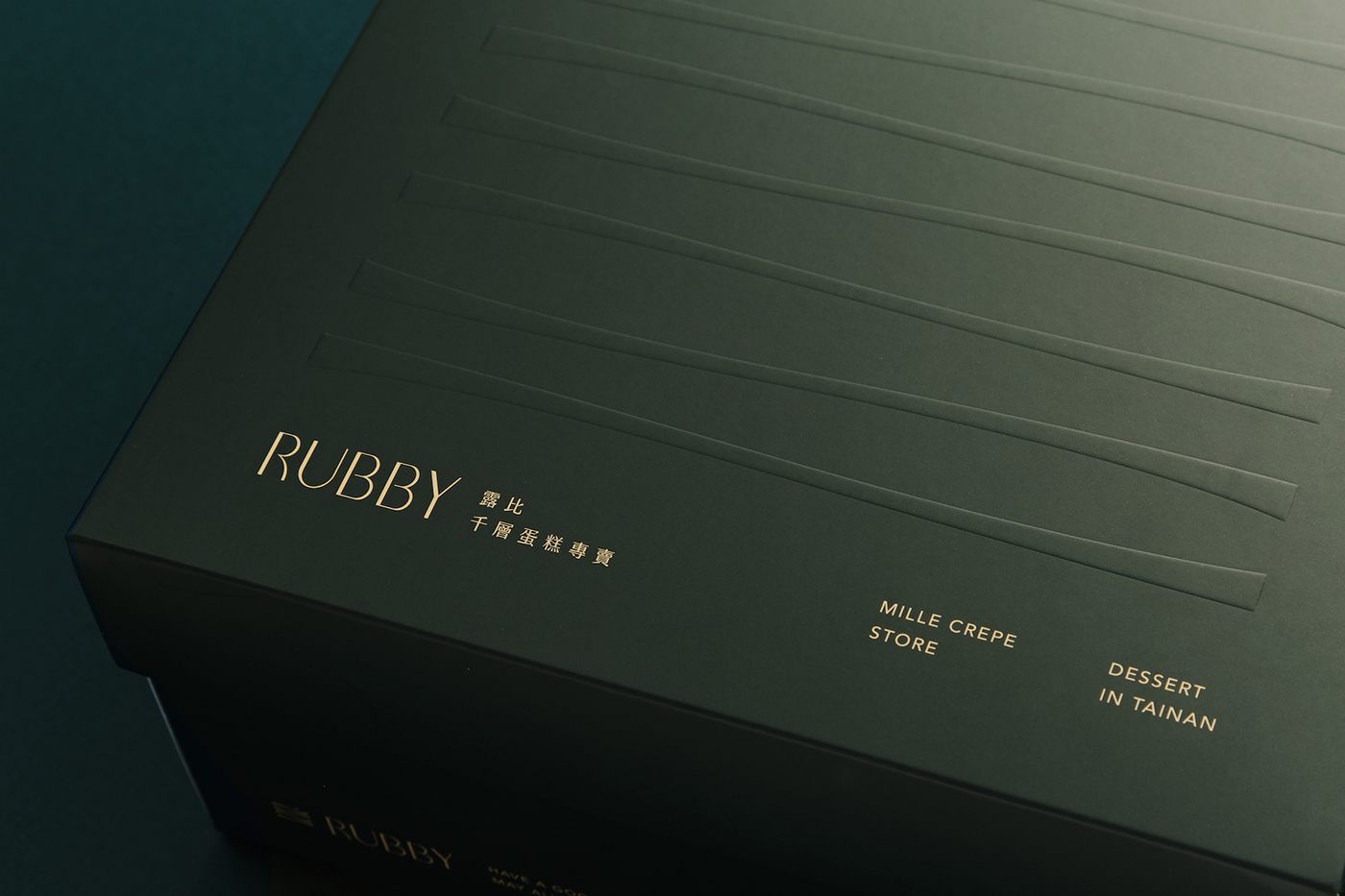
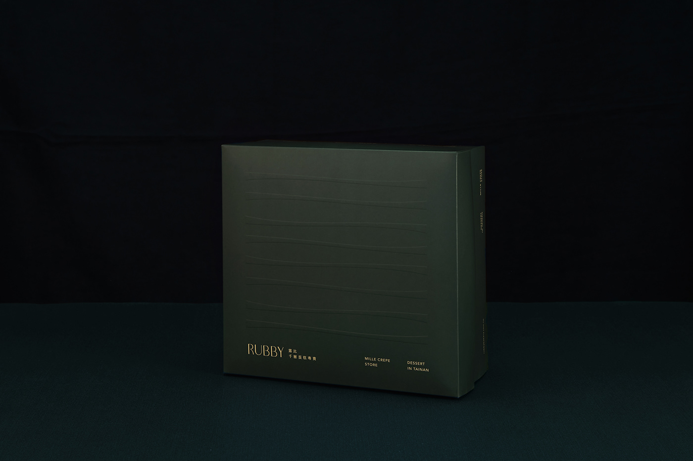
logo以橫切面的千層蛋糕為設計概念,富有曲線的線條, 代表手工堆疊餅皮的律動感,也隱約藏入山稜線的曲線。 象徵著Rubby共同的成長之路。
The logo features a cross-section of a layered cake as the design concept, with curved lines representing the rhythmic motion of hand-stacked pastry. It subtly incorporates the curves of mountain ridges, symbolizing the shared journey of growth for Rubby.


專案類型 Type | 包裝 Packaging.
專案年份 Year | 2023
客戶 Client | Rubby 千層蛋糕專賣
客戶 Client | Rubby 千層蛋糕專賣
製作單位 Production | K9 Design
商業攝影 Photographer | Whitehand Studio


